ZillyPlanet

Turning Student Performance Into Actionable Support
ZillyPlanet's original educator experience was built as an MVP for Math. As the platform prepared to expand across subjects, the experience needed to evolve into a more flexible system that could surface meaningful learning insights across different types of content.
I led the redesign of the educator experience, working with the co-founder/product manager and engineering to evolve existing patterns, incorporate educator feedback, and help teachers move from "How is this student doing?" to "How can I help this student?"
My work spans student, parent, and educator experiences and has contributed to a design system of 100+ reusable components across 27 product surfaces.
Challenge
The Math MVP relied heavily on measures like accuracy and problem-solving, but those patterns couldn't simply be applied across every subject. Science, for example, requires understanding how students apply concepts, analyze evidence, and construct explanations.
The challenge was creating an educator experience flexible enough to surface meaningful insights across subjects while helping teachers quickly move from classwide patterns to individual needs and actionable support.
Without behavioral data from active users, early decisions were informed by educator interviews, secondary research, competitive analysis, educator personas, and existing product patterns.
Spotting Patterns Across the Class
Problem: Science performance couldn't be understood through accuracy alone. Teachers needed to quickly see how students were performing across distinct competencies and identify where support might be needed.
Design: I evolved the existing class performance view into a competency-based experience that surfaces student progress across learning areas using clear mastery states.
Why: Organizing performance around competencies allows teachers to scan for patterns across the class and identify students or concepts that may require additional attention.

Once an educator identified a student who might need support, the next challenge was helping them understand why and determine what to do next.
Simplifying What Matters

Turning Data Into Action
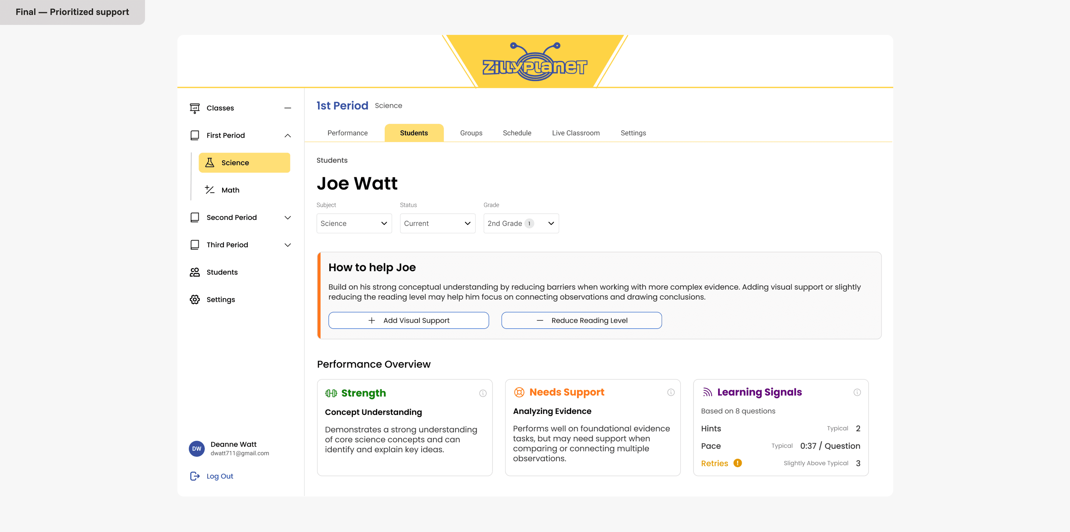
Identifying that a student may need support is only useful if an educator can understand why and know what to do next. I designed the student performance experience to move teachers from a high-level signal to the underlying evidence, then surface targeted actions they could take to support the student.
Designing Across the Learning Platform
The educator experience is one part of my broader role at ZillyPlanet. As the platform expanded across subjects and user types, I also designed new student learning workflows, progression patterns, and reusable components supporting student, parent, and educator experiences
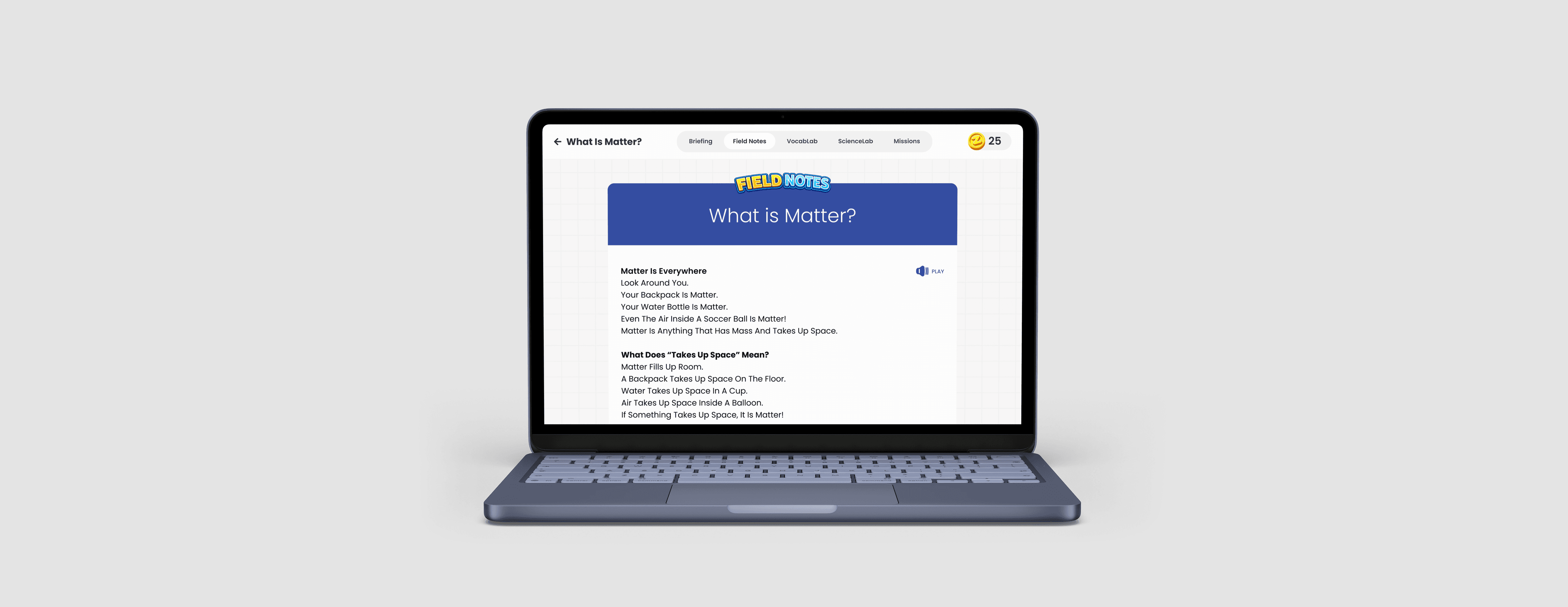
Building on the existing Math experience, I designed the Science learning architecture to support additional modules, flexible navigation, and new progression states. Students could enter lessons from multiple entry points, revisit completed activities, or explore content out of sequence, so I created a navigation model that encouraged a recommended learning path without limiting exploration.

From Workflow to Interface


Making Progress Clear
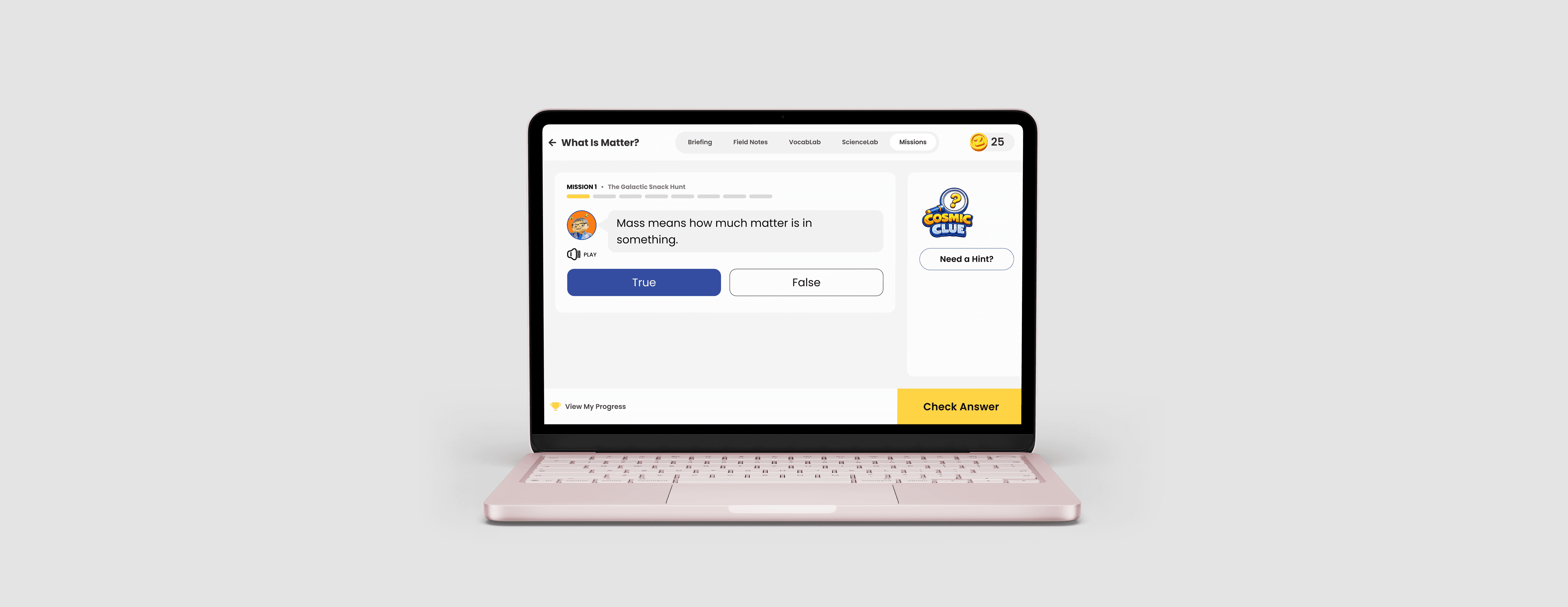
Students needed a clearer way to understand what they'd completed and what remained to master a skill. Early concepts emphasized gamification through streaks and coin rewards, but through review with the founder and PM, we found these elements competed with the more important question: What should I learn next?
I simplified the experience around mastery progression, surfacing completed concepts, what remained, and unlock conditions across practice and challenge modes, while allowing students to revisit completed activities for additional practice.

Building a Foundation for Scale
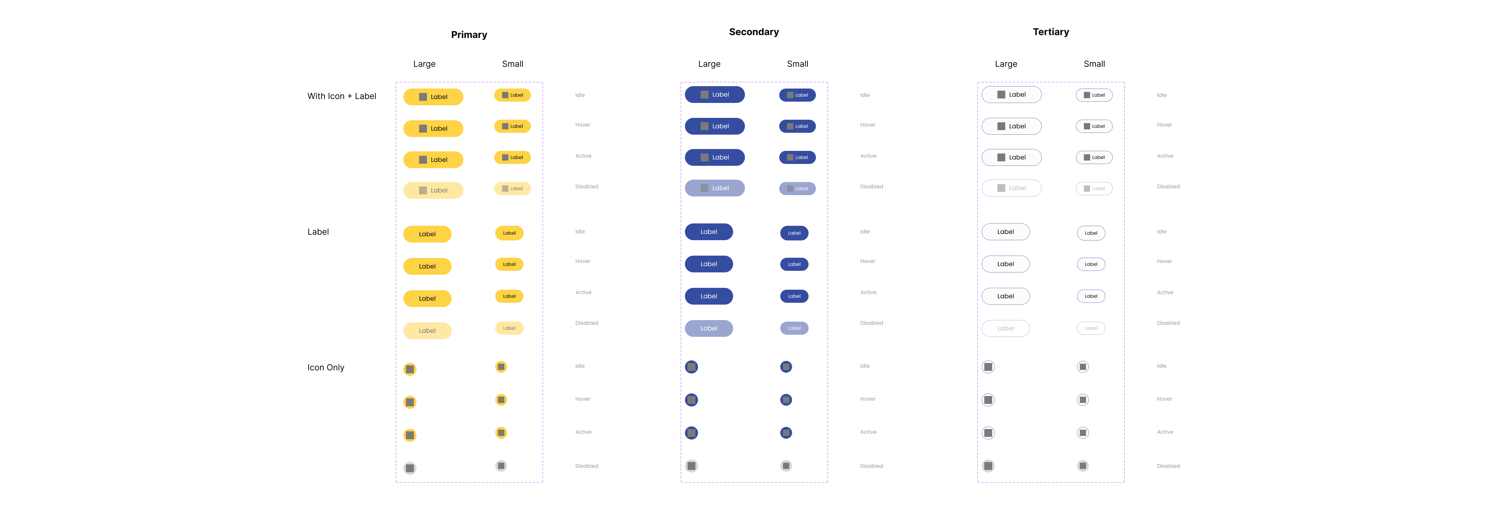
To support continued growth, I audited and evolved the design system to support new experiences without reinventing patterns for every feature. Shared foundations maintained consistency across the platform, while flexible variants allowed the product to adapt from accessible, engaging student experiences to denser, data-rich experiences for educators.
Impact
Reflection
Working at an early-stage startup has taught me to get comfortable designing without always having a clear roadmap or perfect information. I've learned to find other ways to make informed decisions when research is limited, collaborate closely with product and engineering, and stay flexible as priorities and requirements evolve.
Designing across students, parents, and educators has also pushed me to think beyond a single type of user. Each group has different goals, needs, and levels of complexity, and I've learned to adapt the experience while still making the product feel connected as a whole.