Restora

Product Designer
Mobile App
5 weeks
2025
Supporting Patients Throughout Their Perioperative Journey
Restora is a mobile app that helps patients navigate recovery after surgery through personalized nutrition, guided movement, and daily symptom tracking.
Over five weeks, I led the end-to-end design process, from research through usability testing, to address gaps in perioperative care. Leveraging my healthcare background, I designed and validated a prototype that reduced task completion time by 30%.
Outcome
Problem
How might we empower surgical patients to safely improve their strength, mobility, and recovery when they receive limited clinical support and struggle with drug-induced cognitive impairment and low appetite?
User Research
To better understand user needs and the market, I conducted 5 user interviews, completed a competitive analysis of existing recovery tools, and conducted secondary research on patient adherence and readmission rates. I utilized AI for interview transcription, assisted data synthesis, and preliminary affinity mapping to help create my persona.
Competitive analysis revealed that existing recovery apps primarily focus on exercise tracking or medication reminders, rarely integrate nutrition guidance, and rarely address the cognitive and physical limitations of post-surgical patients, creating an opportunity for a more holistic approach.

Results

Defining the MVP
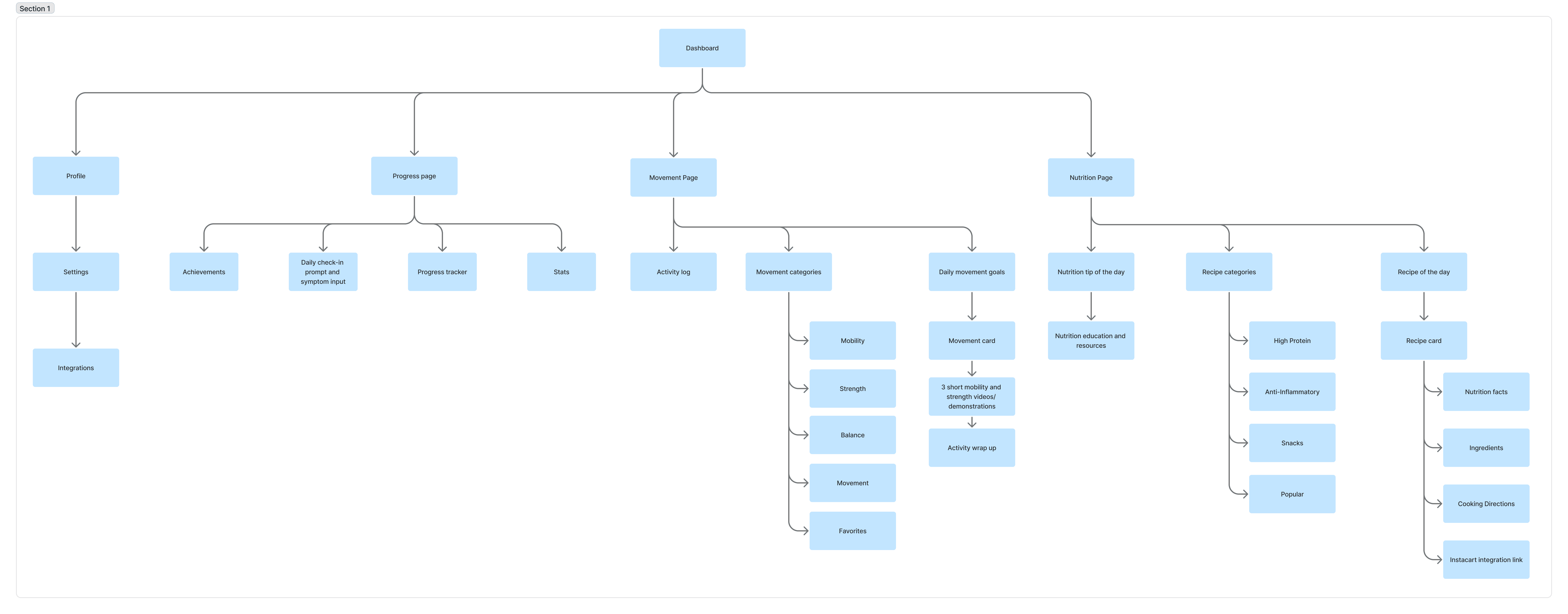
IA & Sitemap
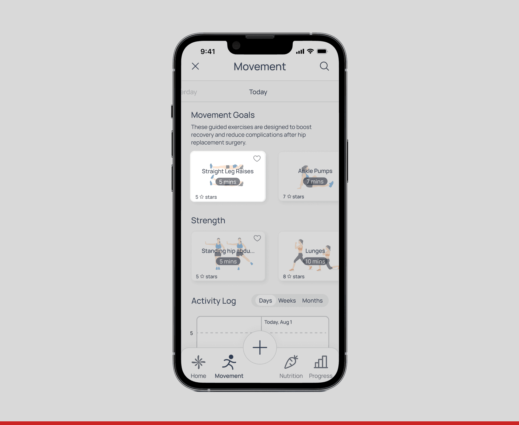
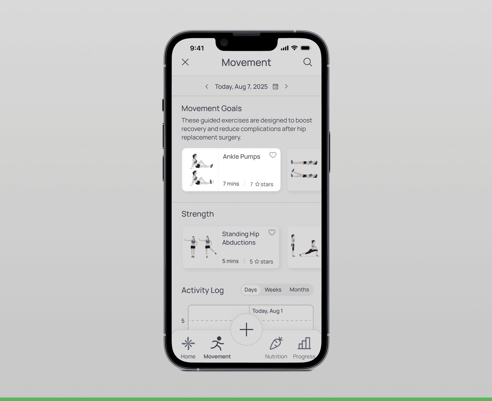
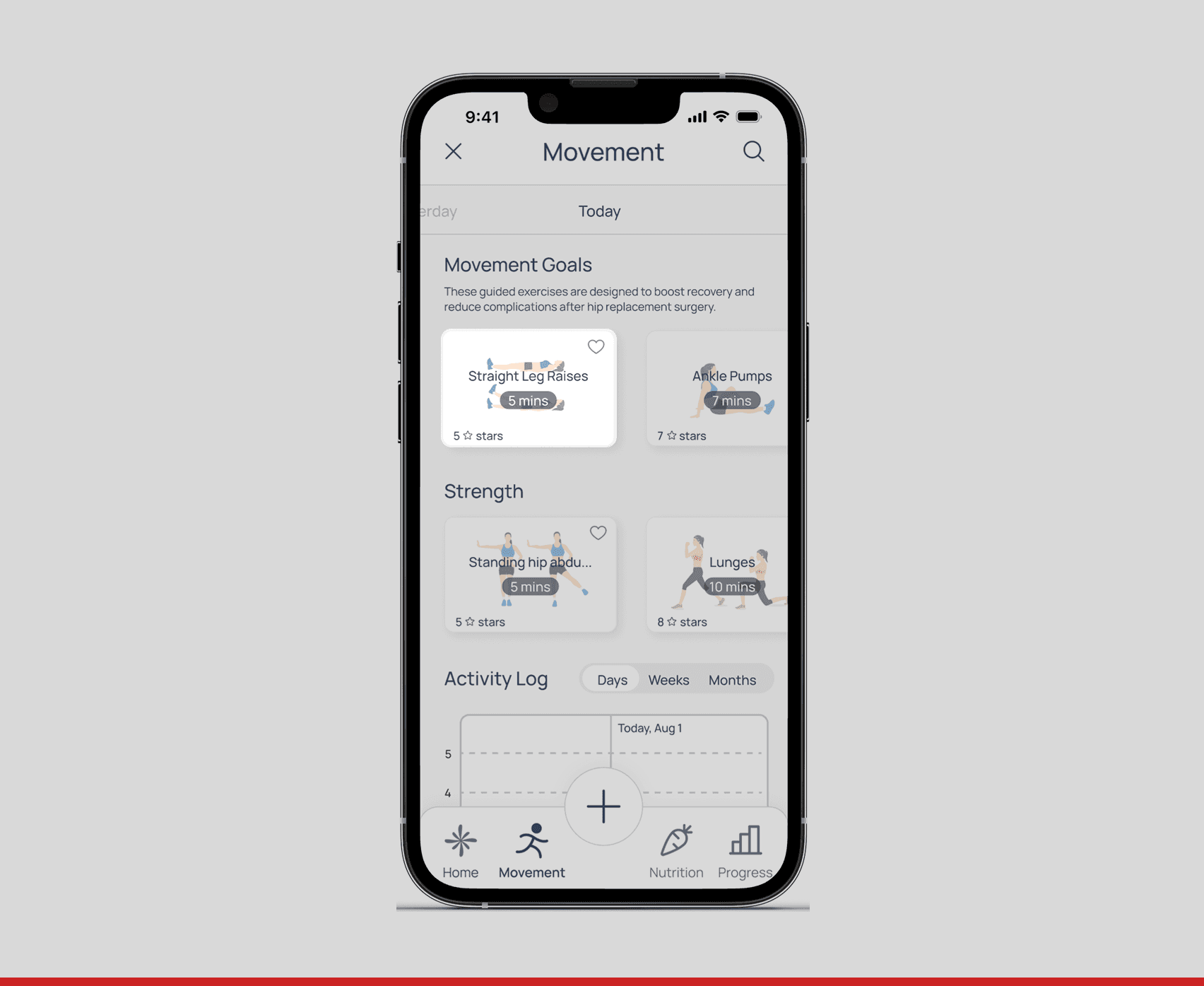
Based on research showing that post-surgery medications cause disorientation and cognitive impairment, I prioritized a simple, flat information architecture. The sitemap reflects a three-tab structure (Nutrition, Movement, Progress) that minimizes navigation depth and allows users to access core features with minimal taps, critical for users with limited energy and attention.
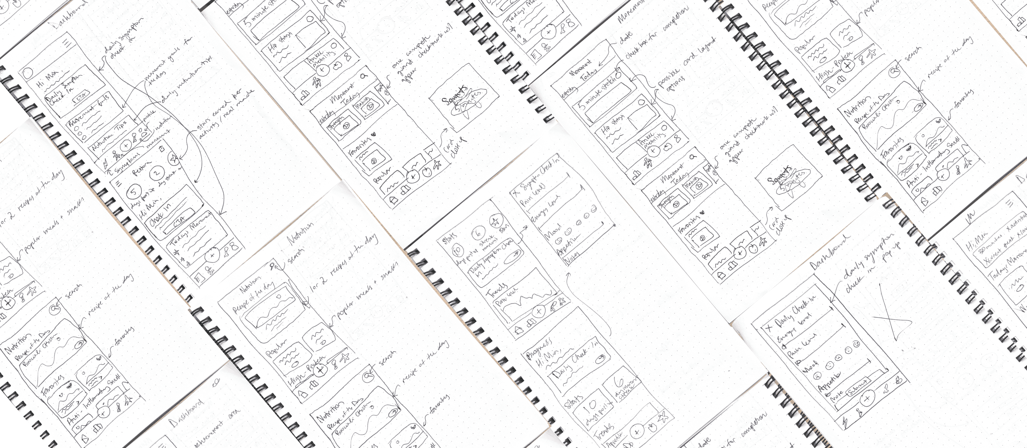
Wireframes
I explored multiple navigation models before settling on a three-tab structure informed by research around cognitive load.
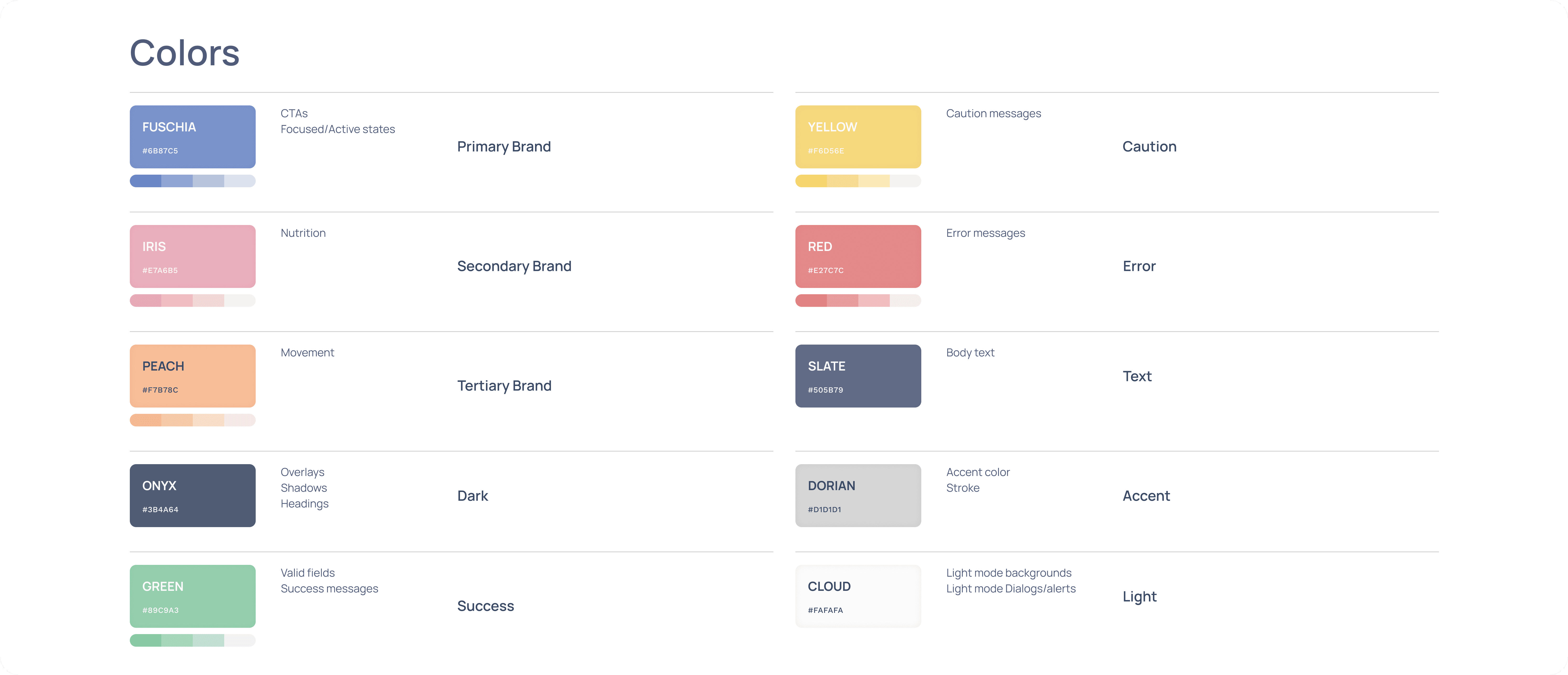
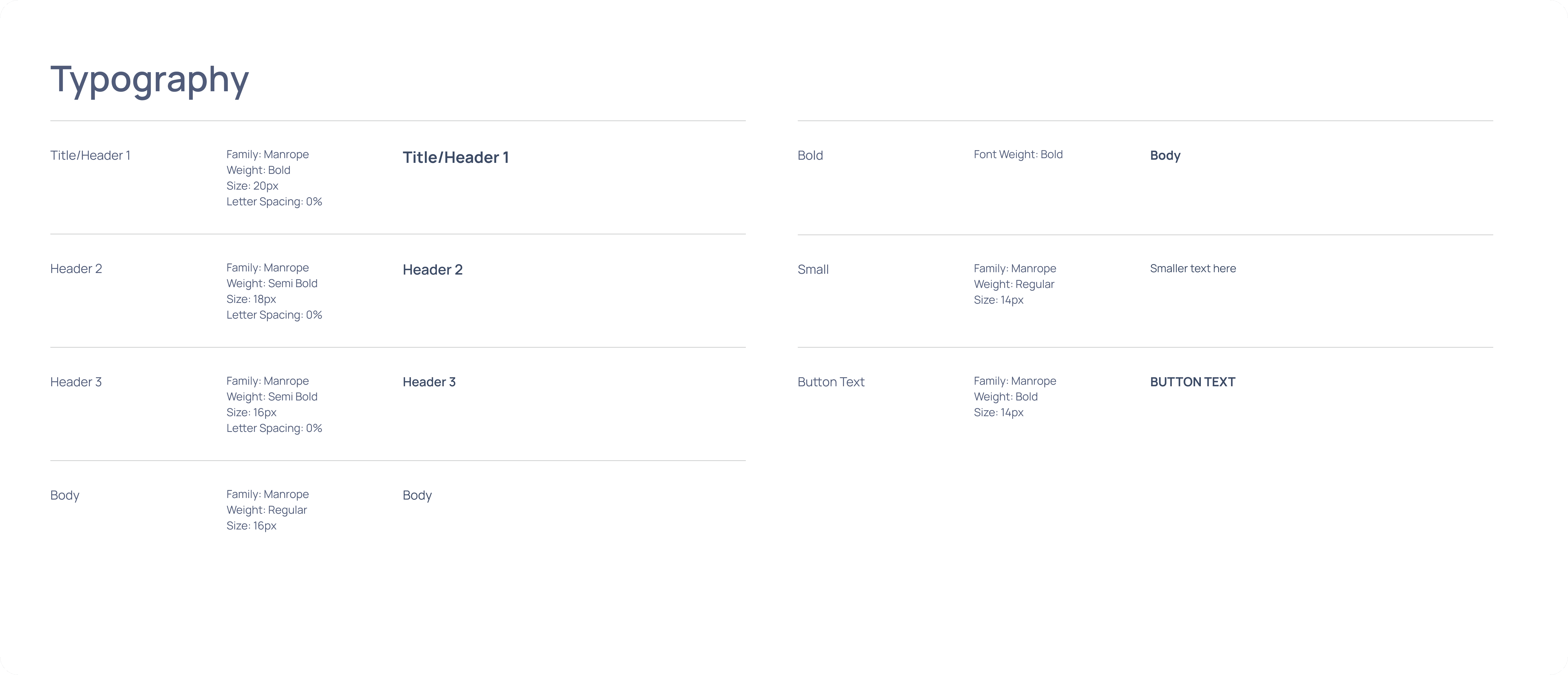
Design system
To accommodate users experiencing fatigue, limited dexterity, and medication-induced cognitive impairment, I designed a system emphasizing large touch targets, high color contrast, consistent spacing, and clear typography that meets WCAG accessibility standards.
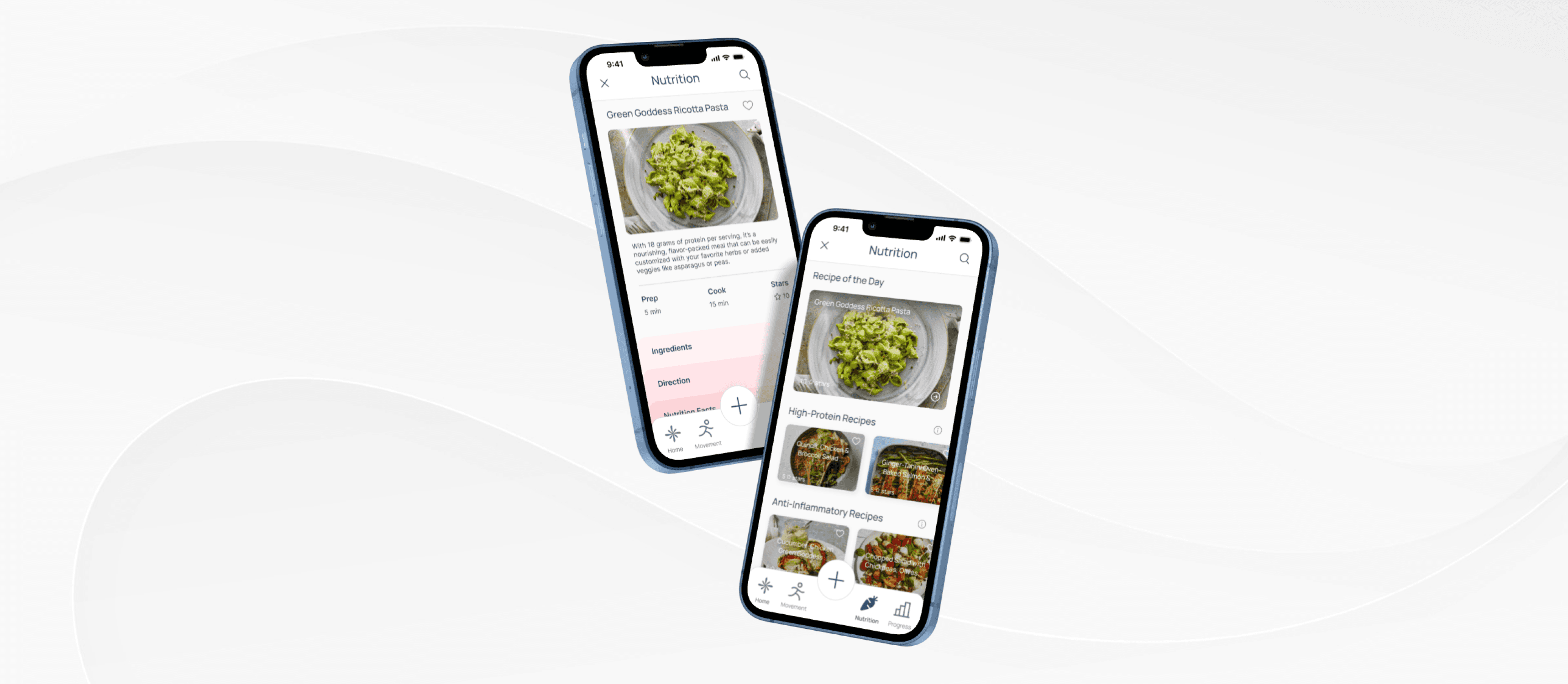
Feature #1: Nutrition Guidance
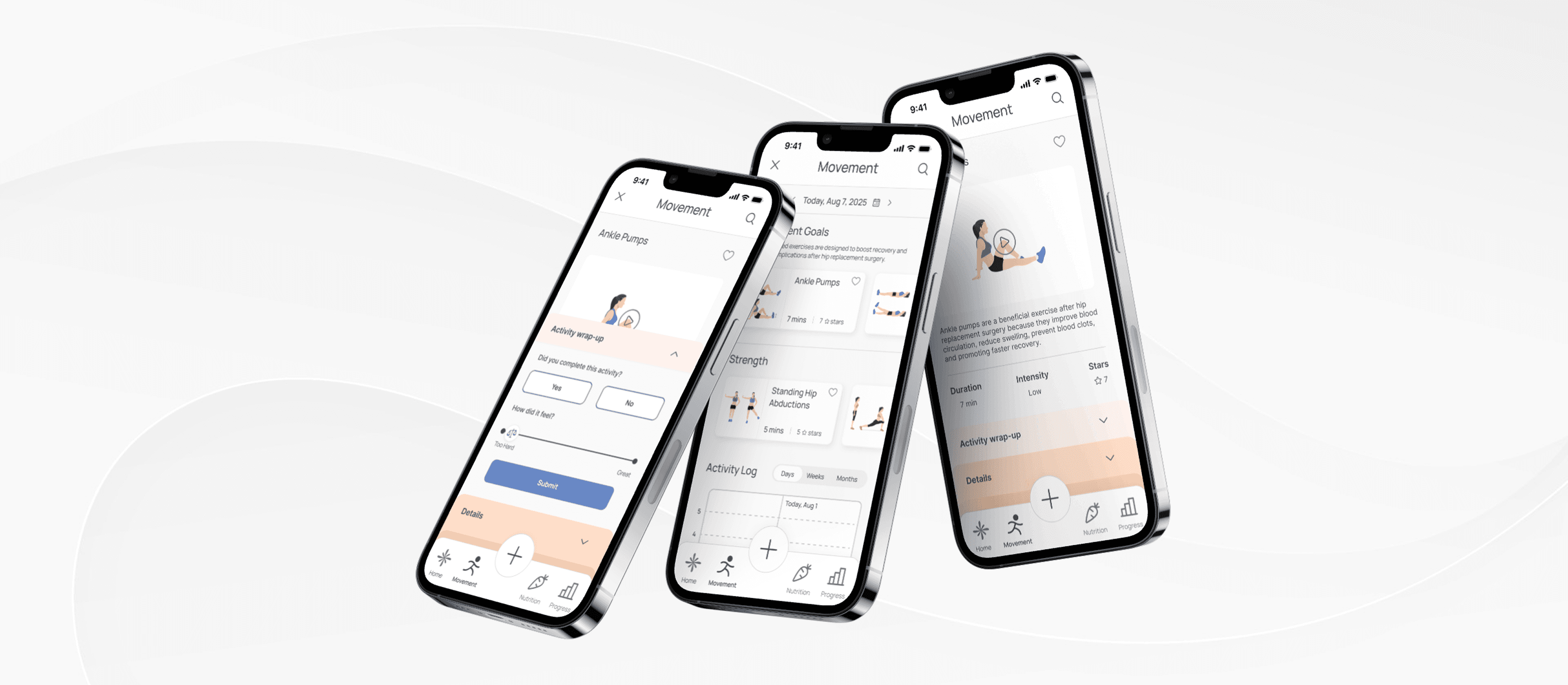
Feature #2: At-Home Movement Support
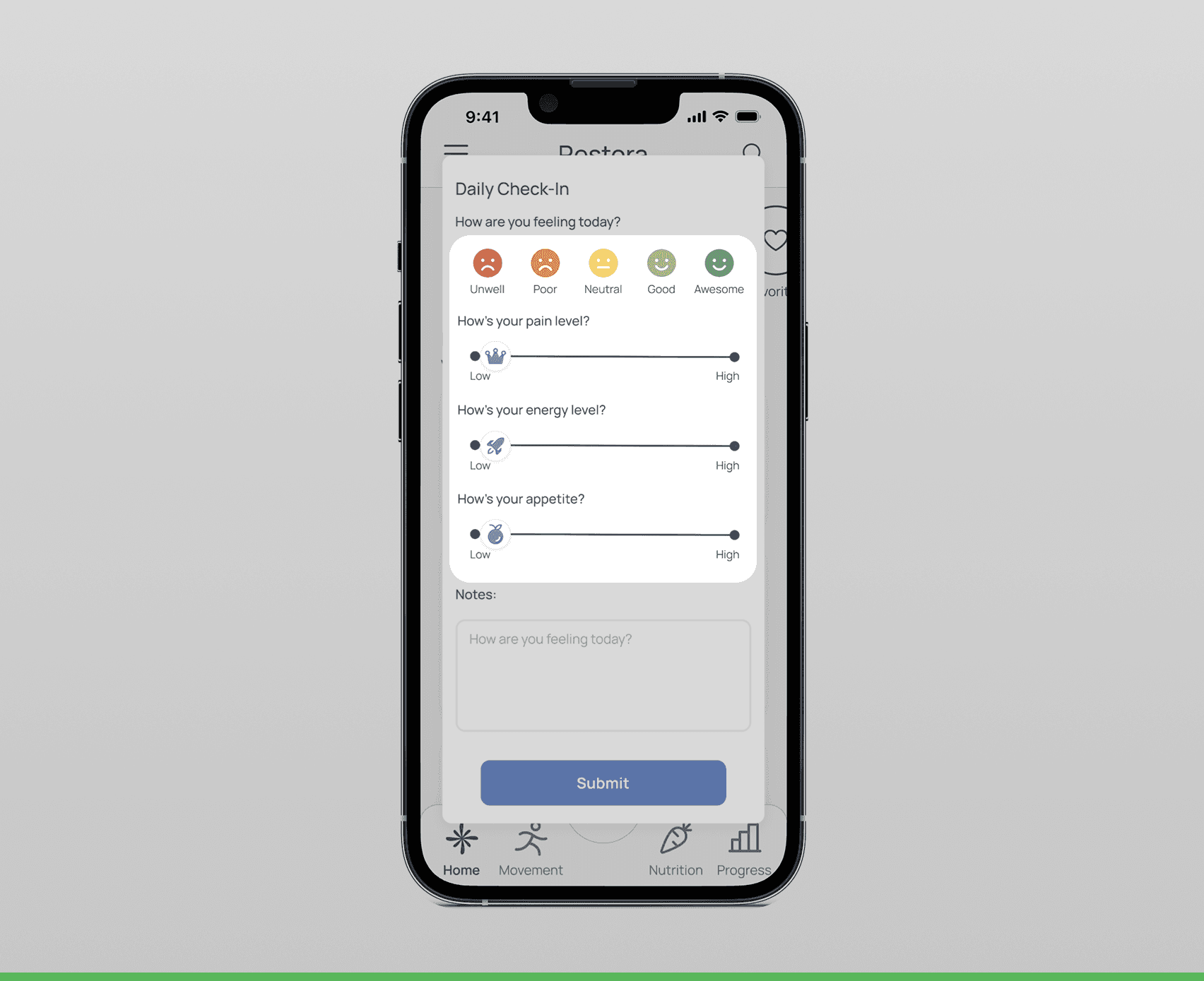
Feature #3: Daily Symptom Check-in
Listening, Testing, Refining

Impact
Real-World Viability
This project pushed me to think beyond individual screens and consider the broader ecosystem shaping user success. I didn't just design for immediate recovery tasks; I explored how Restora could deliver sustained value while remaining economically viable.
Beyond the user experience, I explored how Restora could realistically reach patients. I considered both a direct-to-consumer subscription model and partnerships with hospitals that could provide the app as part of post-operative care. Thinking through these tradeoffs reinforced that successful products must balance user needs with sustainable business models.
Designing Restora reinforced that solving user problems also means understanding the systems surrounding them. Considering user experience alongside business viability challenged me to think beyond individual screens and design a product that could create a lasting impact.

