Ripple
Product Designer
Responsive Web Design
5 weeks
2026
Microsavings Responsive Web Design
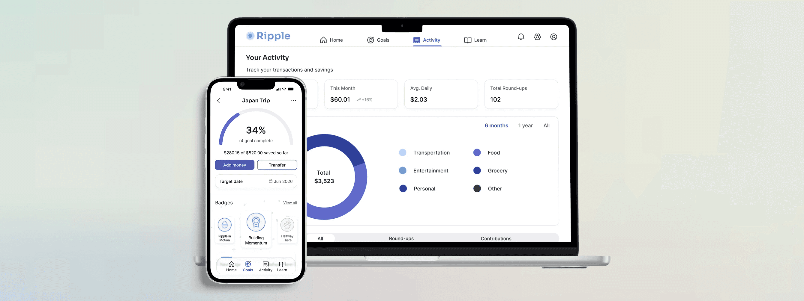
Ripple is a fintech platform that helps young adults build savings habits through flexible goal tracking and financial education. Over five weeks, I designed a responsive web experience from research through usability testing, improving task completion and user confidence. Research revealed that the real barrier wasn't motivation; it was financial confidence, which became the guiding principle for the product strategy.
How might we help young adults build savings in a way that adapts to their financial limitations while increasing confidence and consistency over time?
User Research
To gain a deep understanding of users’ saving behaviors, motivations, and pain points, I conducted 5 user interviews, 13 user surveys, and analyzed comparable micro-savings and investment products.
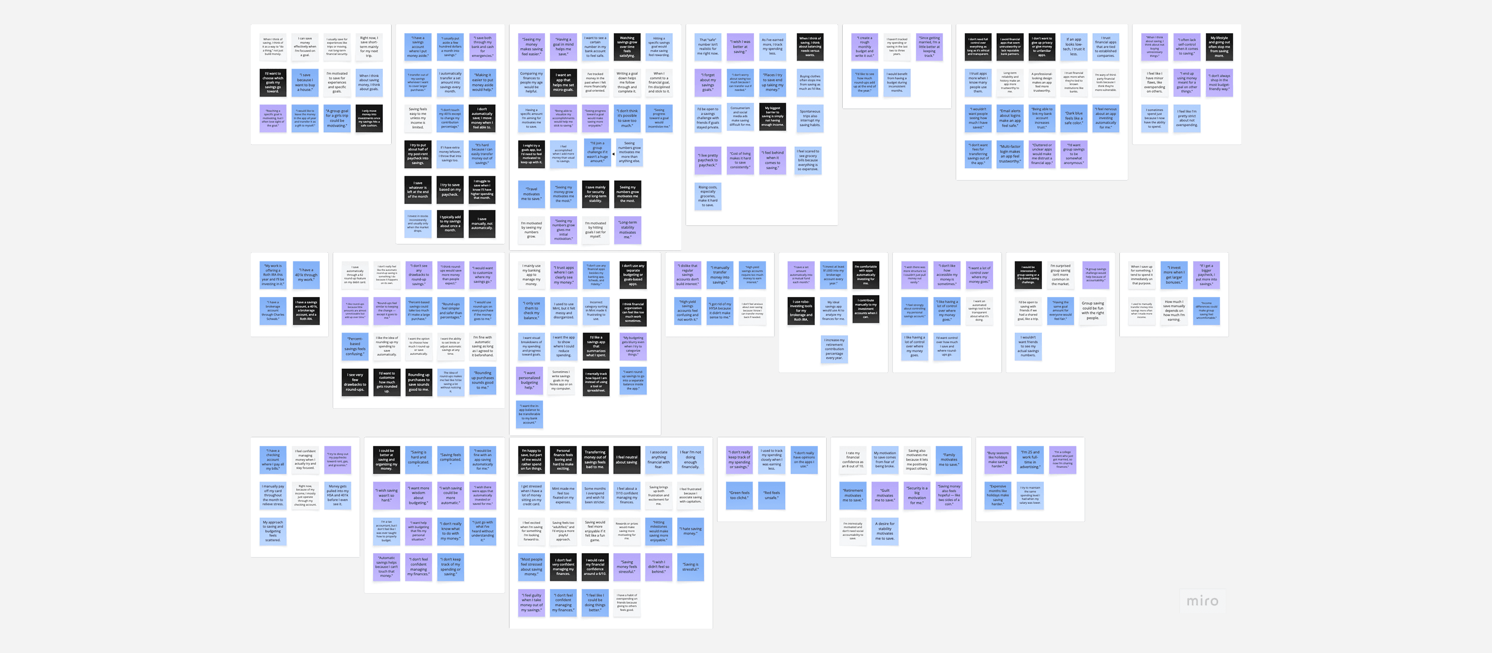
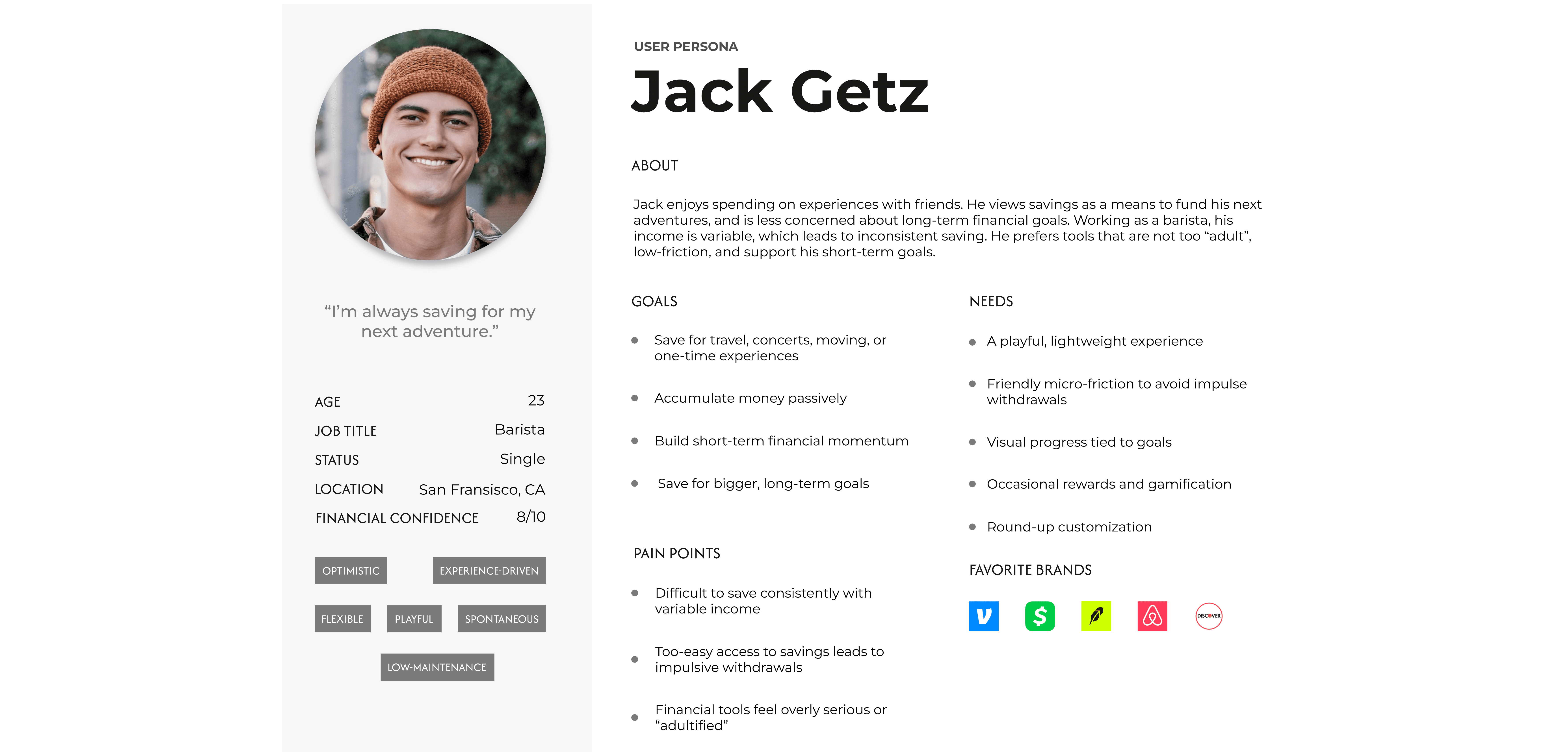
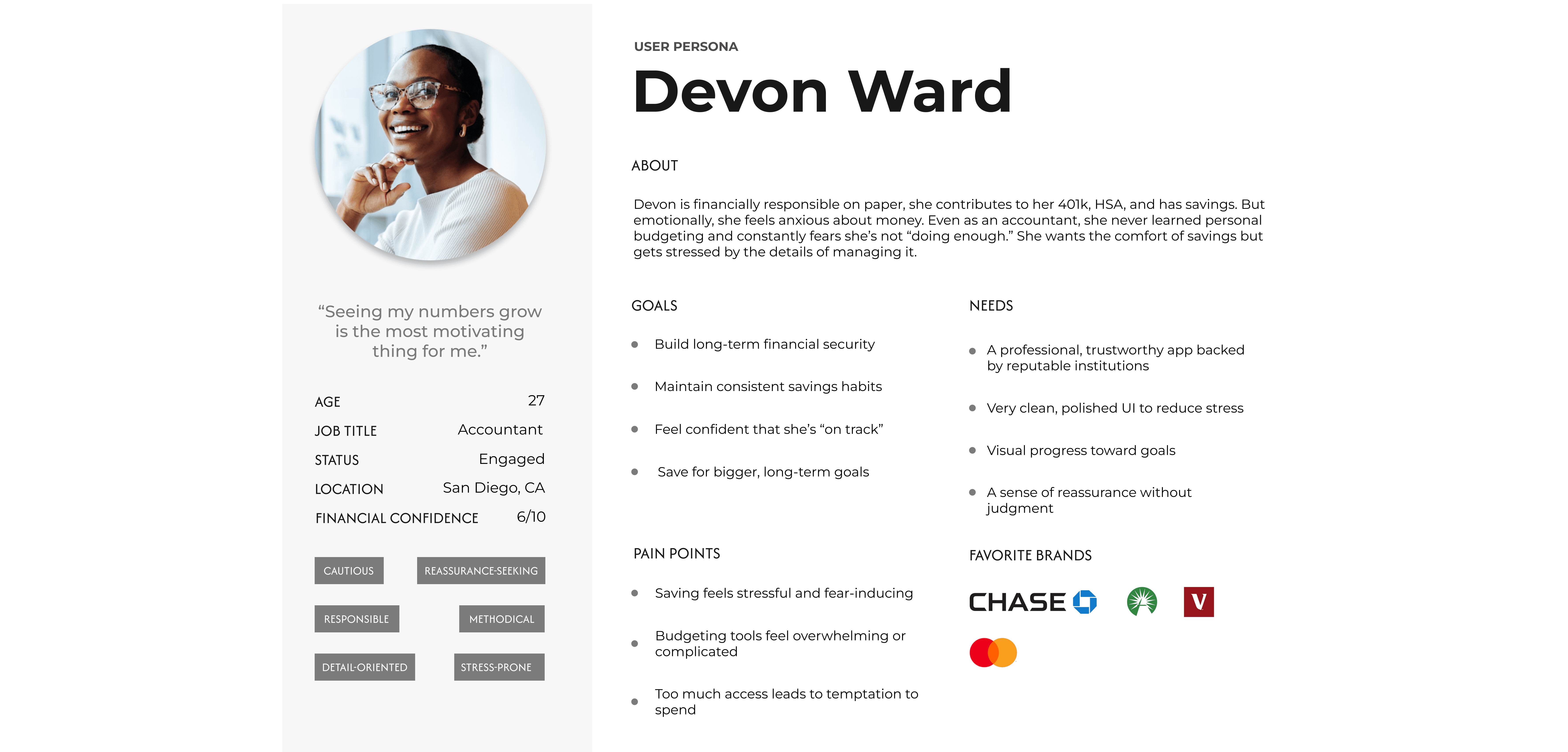
AI-assisted transcription and synthesis tools were utilized to efficiently extract key insights and create an initial affinity map, which I then refined manually to identify patterns, tensions, and areas of opportunity. These insights informed the creation of two personas that grounded design decisions throughout the project.
Key Findings
Defining the MVP
My initial concept was a comprehensive personal finance platform combining budgeting, investing, debt management, and savings. I believed consolidating financial tools into one place would reduce overwhelm and help users feel more confident. However, research challenged that assumption. I realized I had been designing for comprehensive financial management when what users actually needed was the confidence to take one small step. That insight fundamentally changed the product strategy. Instead of expanding the feature set, I narrowed the MVP around four core experiences: flexible saving, visible progress, transparency, and financial education.
User Journey
Wireframes
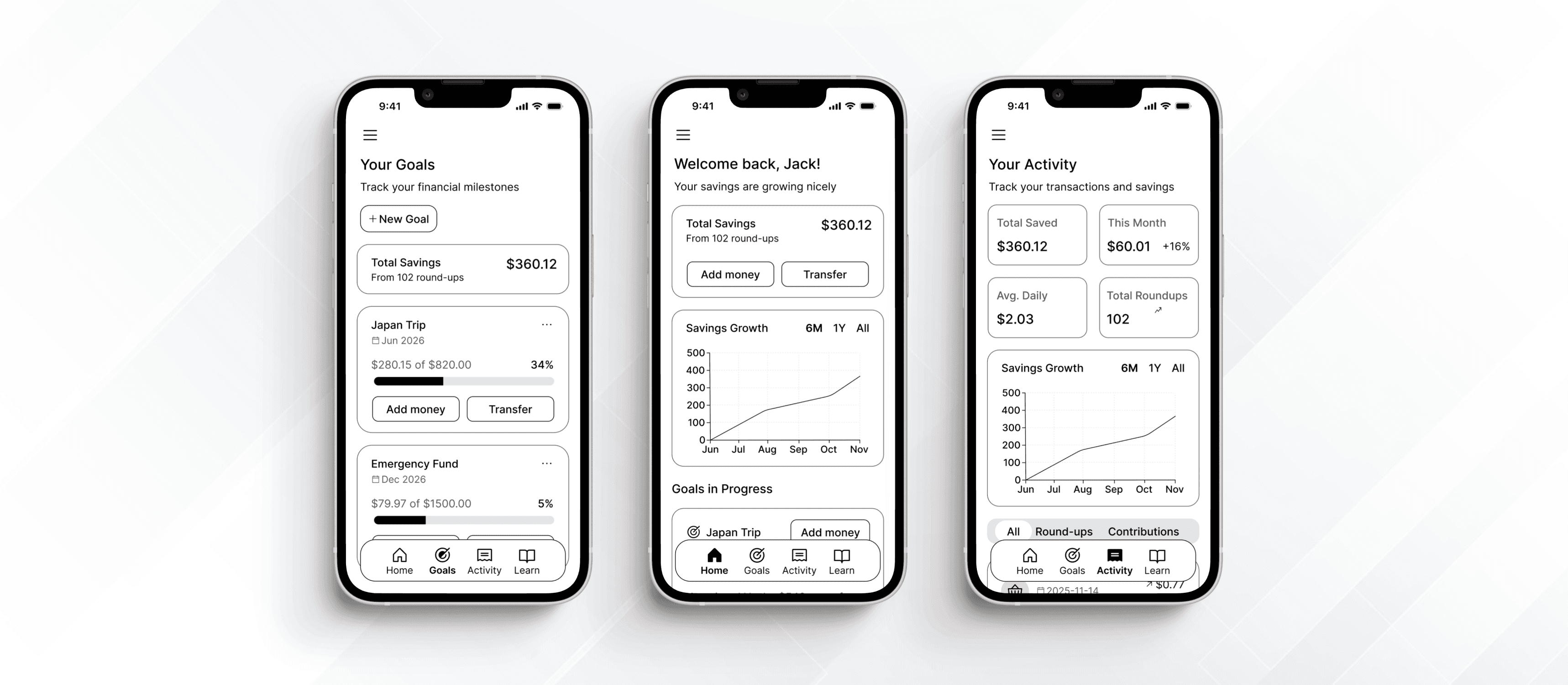
I explored several navigation patterns before settling on a mobile-first dashboard centered around savings progress. Because participants primarily managed finances on their phones, I prioritized quick access to balances, goals, and activity with minimal navigation.
Design System
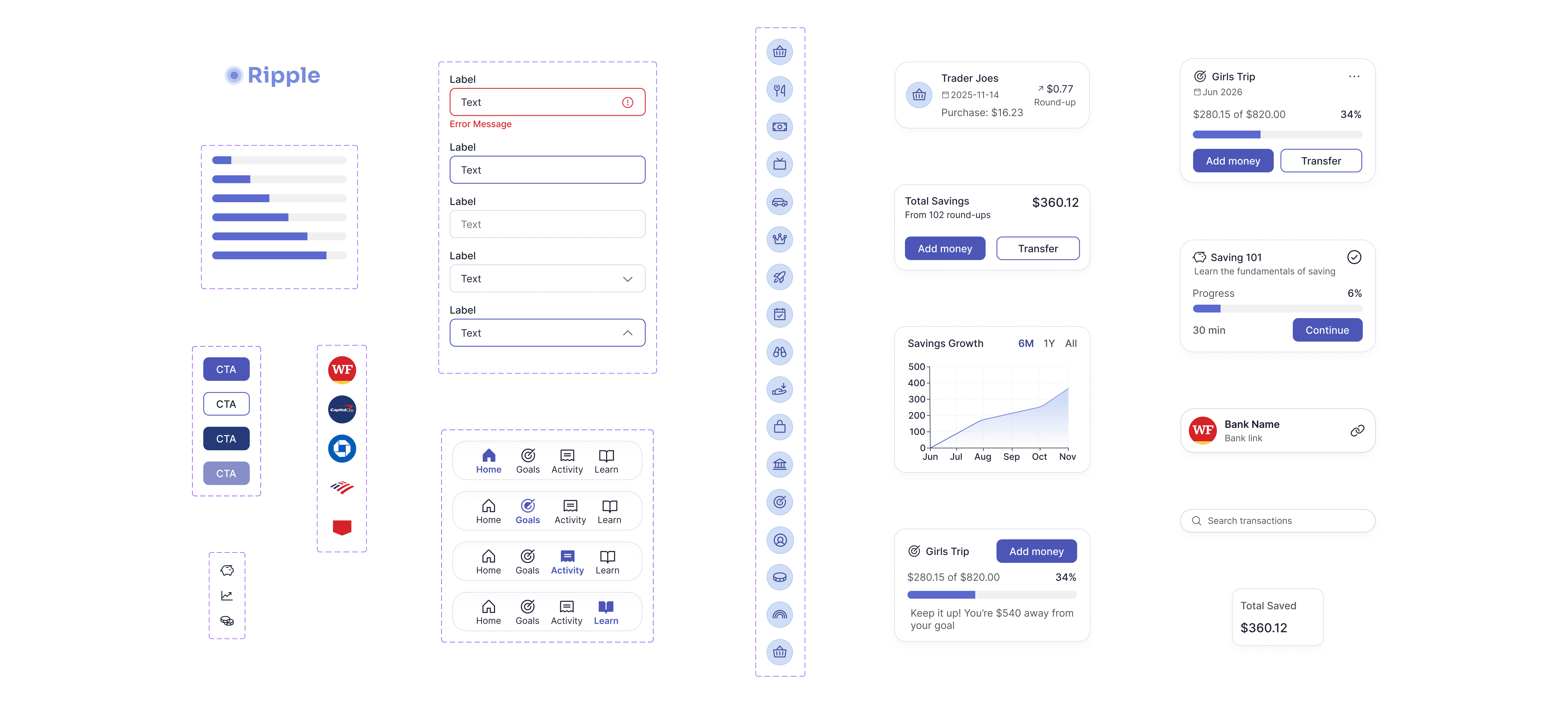
To create a consistent experience across mobile, tablet, and desktop, I built a responsive design system using reusable components, accessible color contrast, and a scalable typography hierarchy. Designing these foundations early allowed me to iterate quickly during testing while maintaining consistency across breakpoints.
Feature #1: Onboarding
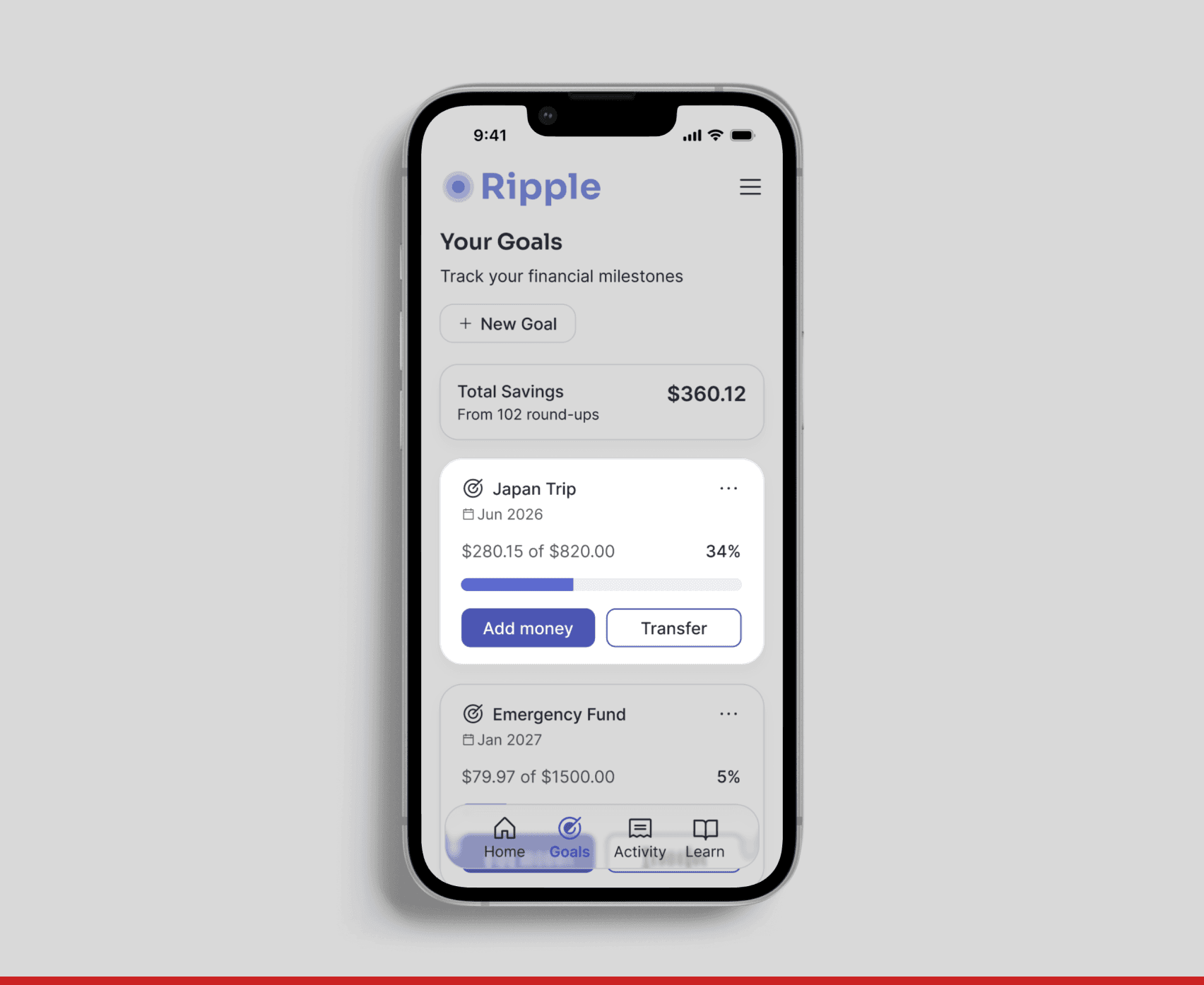
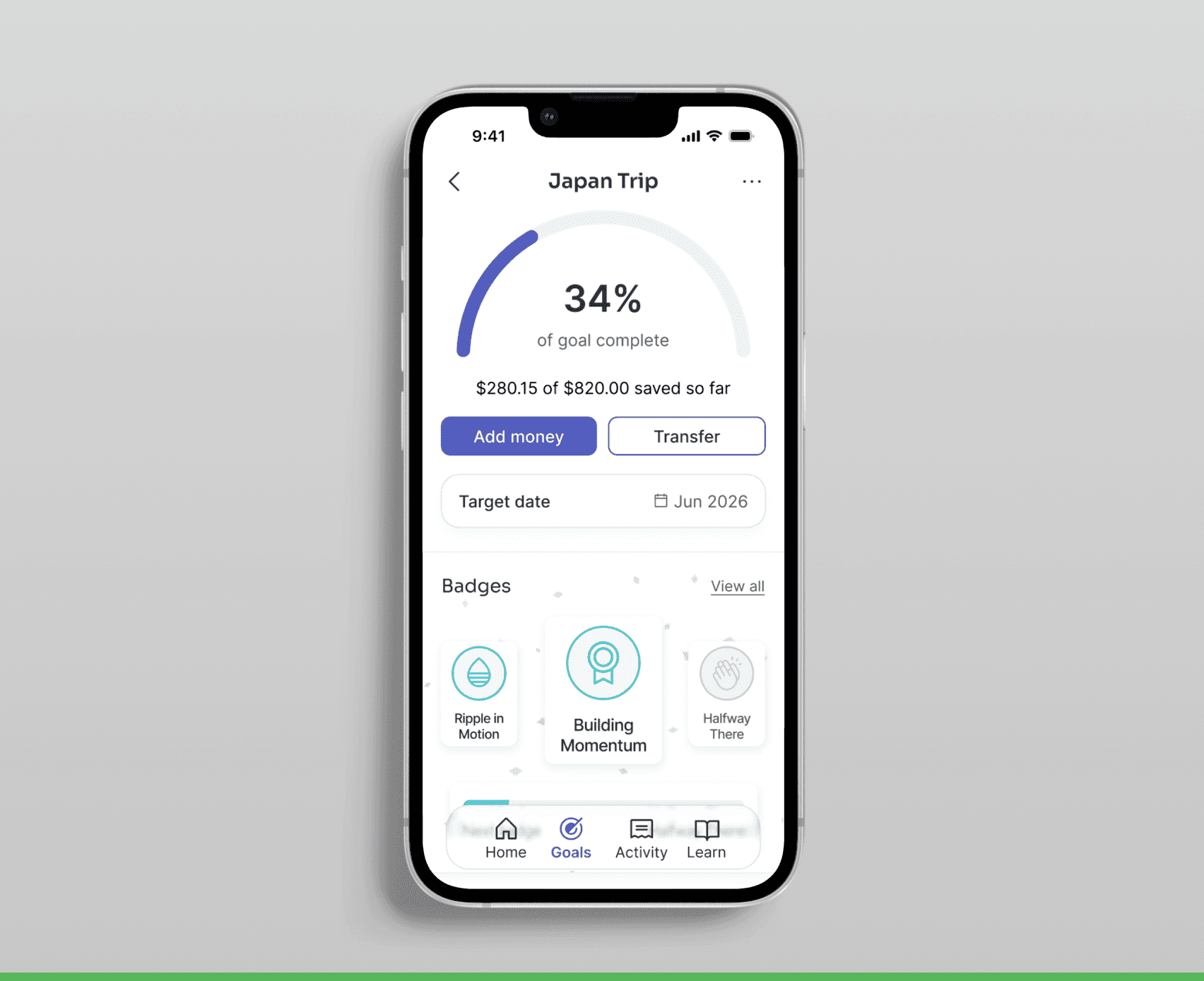
Feature #2: Goals

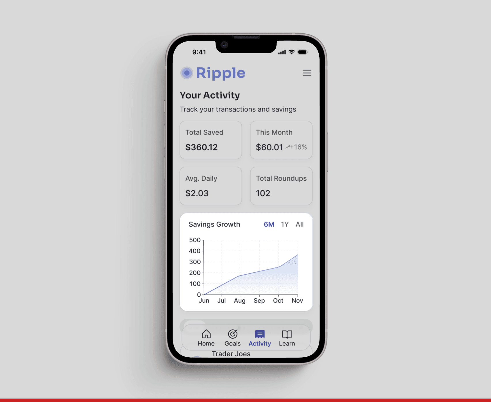
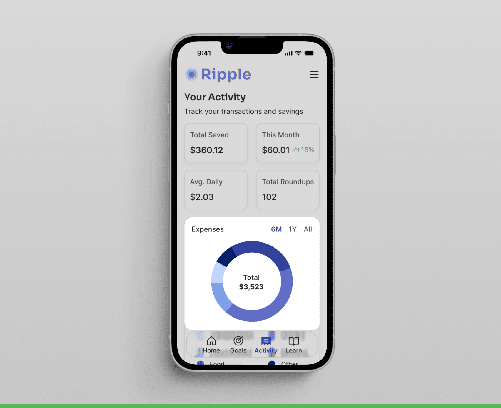
Feature #3: Activity

Feature #4: Learning

Usability Testing
I conducted 5 remote and in-person usability tests to evaluate task clarity, completion rates, and feature comprehension. Key iterations included:
Interactive Prototype
I built a functional prototype to validate core features and responsive design across devices.